
Inside an Illustrator's Mind
|

|
|
|
|
|
If you’re like me, then most words you read not only elicit an emotional reaction out of you but a visual one as well. The white page shifts to light and the letters break and coil into shadows to form an abstract image that only feeds the bliss you feel as you pick up a book. It is one of the greatest gifts of literature - imagination. As the illustrator of both “The Porridge of the Countess Berthe” and “Goblin Market” I was not only tasked with expressing the bursts of creativity they brought, but also weave in them the emotions that seeped between the lines. I’ll be honest - on a professional aspect - I had little experience beforehand and to say I was intimidated would be an understatement. Not only was I working for a publishing house, but it was a foreign one at that (I am from Bulgaria). Which is why I am incredibly grateful to Cybirdy Publishing for trusting me with the important job of creating one of the main impressions a person gets from a book. It was a hard process but one also rich with lessons, emotions and most importantly - creativity. I am writing this in hopes to share at least a flicker of all that with you, dear readers. “The Porridge of Countess Berthe” is a charming fairy tale by Alexander Dumas often overlooked as opposed to many of his other more well-known pieces (The Three Musketeers for example). Although it has a humorous, almost light feel to it, beneath that veil of joy lay many different topics like kindness as a moral standpoint, the importance of tradition and of course - the consequences of one’s own actions (which in this case is the judgement of little dwarves). These motifs are skillfully wrapped around characters which often follow the classic fairy-tale archetypes.
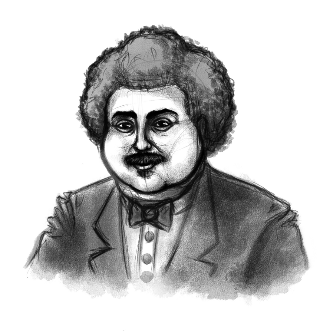
Said characters were mostly what interested me as an illustrator and is probably the most important part of the process. The impressions the author wanted to convey and those I aimed to achieve had to match, after all - my work only accompanies that of the creator, but they also have to have their own flair so to speak. I am an artist after all. For me personally, people have always been the hardest subject to portray. They are complex, full of expression and every single one of us is different. That individuality is what makes us human, what makes our experiences stand out. That is the core of my work - show the readers not the length of a character’s hair, the shape of their eyes (although that, of course, is important as well) - but their individuality. The first person I illustrated was not a character, but the author himself - Alexander Dumas. What I’m about to say has no logic or reason, but it is the absolute truth - he looks exactly the way his creations do. A kind-faced man with soft features which bring a sense of tranquility, but when one looks further, they notice the depth, the complexity and once again, the individuality. He actually resembles a close friend of mine quite a lot, so do note that my perception of him may tend to be biased. I was asked to keep the portrait in a sketchy style, and I have to say that is in fact the best decision that could have been made (I cannot speak for other artists, but for me it is so), because a sketch is the easiest way (for me) to express a person’s soul. A sketch is dynamic, it adds depth without limitations and offers a raw, unprocessed perspective. It has always been my most favourite process of any piece I draw.
In hindsight - I gained a lot of experience with this project. Although after two years (more or less), when I look at the pieces I can’t help but notice mistakes, things I could have done better. That is natural for any artist, but I’ve learned to look at it from a positive standpoint - I grew. And I did so very quickly thanks to the opportunity that I had. The next project I will be talking about is the “Goblin Market” by Christina Rosetti. I am a fan of poetry and even write some in my leisure time, but of this author I had heard only a name (This is due to the lack of Bulgarian translations for any of her works as far as I could find). This piece was an amazing introduction to her art and I soon found myself searching for more. A poem I find easy to read and despite its overall grim feeling, it also strikes me as light (I understand that might not be an objective opinion). It covers many topics still valid to this day like the dangers of temptation, the familial bonds and the thin line between life and death. What made a lasting impression on me was how skillfully the nuance between self control and said temptation was portrayed. Life is, as I’ve found, rarely black and white and although that cliche can be found everywhere, few people can describe that “gray” area, so to speak, that well. Because in reality it is not easy, that’s why temptation is a struggle people have always faced in one way or another and is the central point of the Biblical understanding of our humanity. A poem is often much harder to illustrate, since the focus of the genre is the expression of emotions, not descriptions. And yet because of that I found it much more intriguing as a process. Christina Rosetti was much more difficult for me to capture as well, and I still am unsure why exactly that was. I decided then, that it is best to focus on the eyes that, to me, are the most important part of a person’s expression. They were direct and sharp, I found that rather mesmerizing. I still do not think my representation was perfect, but I can only hope at least I did her some justice.
I am a person who puts their heart into their work (as any work should be done, really) and I was happy to collaborate with people who do the same. Book illustrations are not just an image that aims to copy the original author, but a fellow artist hoping to capture the essence of the piece and extend it forward. It was an amazing experience and I hope that most of all you, dear readers of Cybirdy Publishing, enjoy the result. Eva Vasileva, Illustrator |


